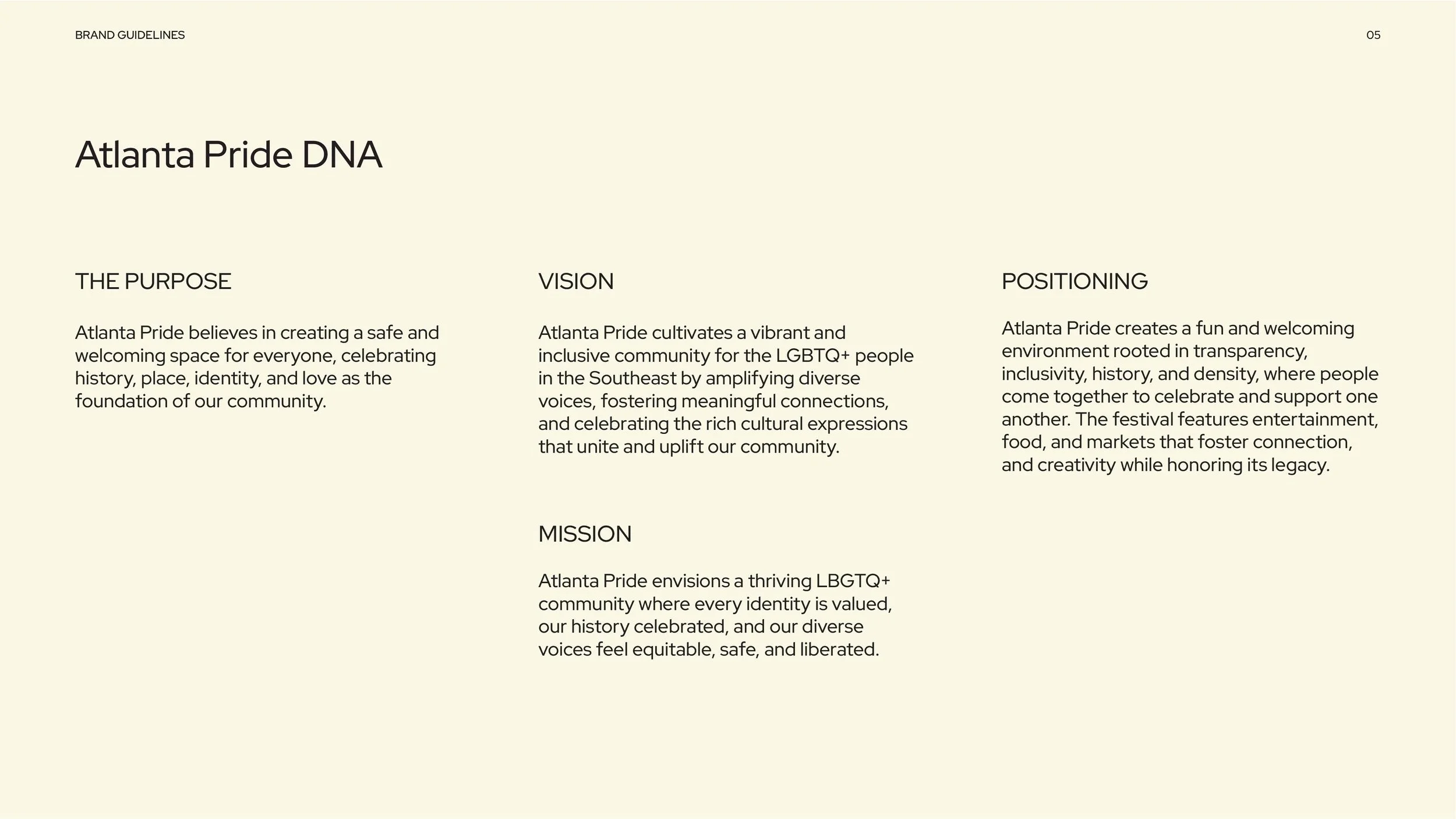
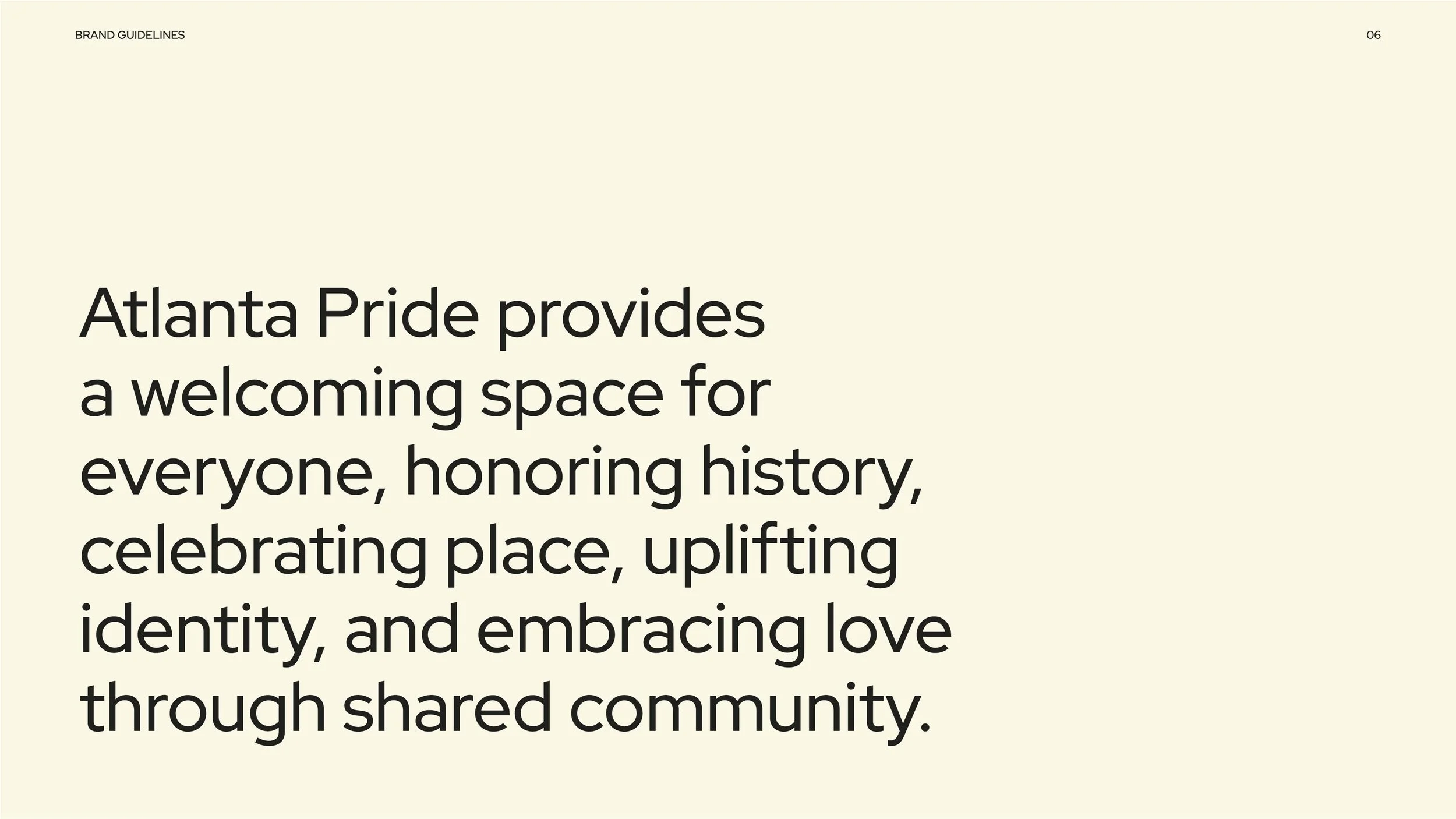
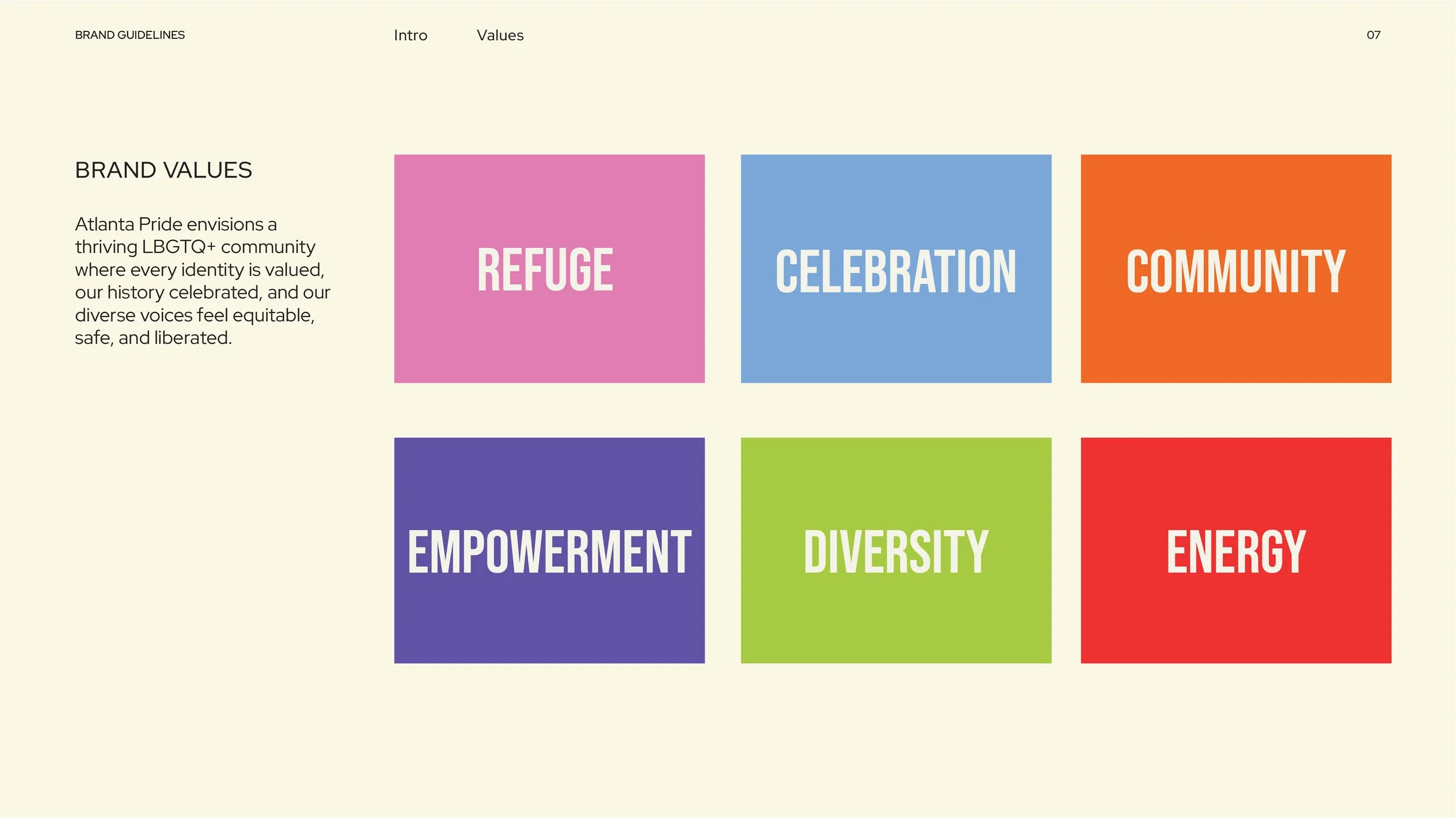
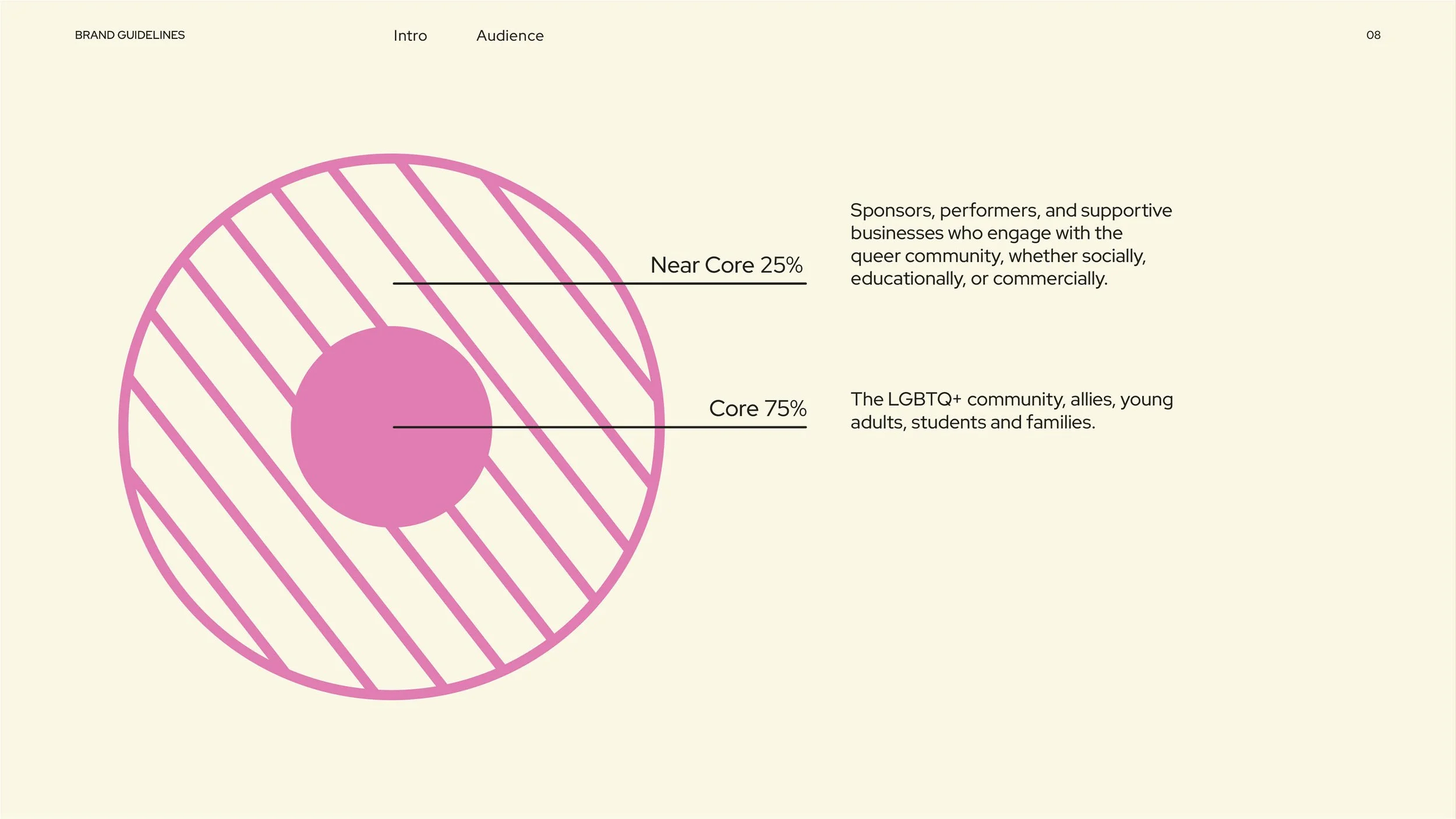
Atlanta Pride
BRAND AND IDENTITY DESIGN
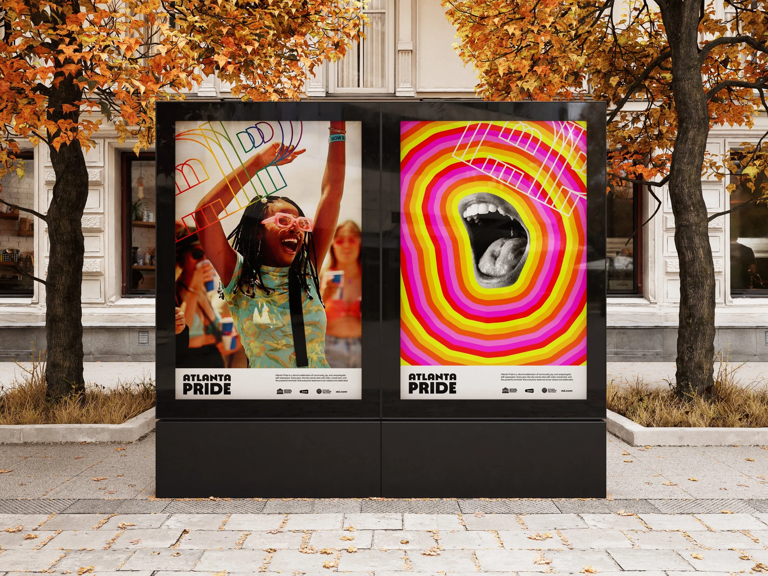
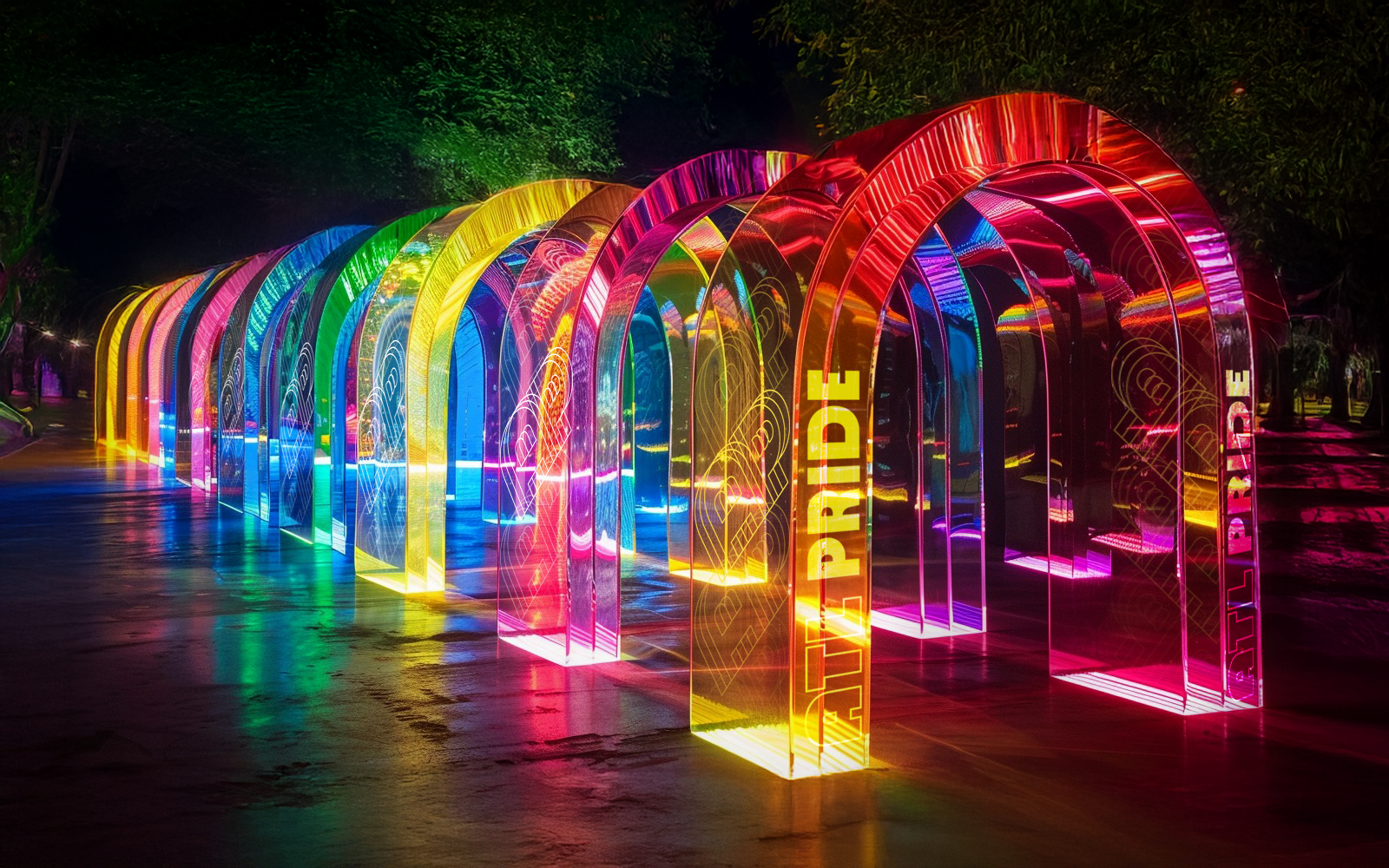
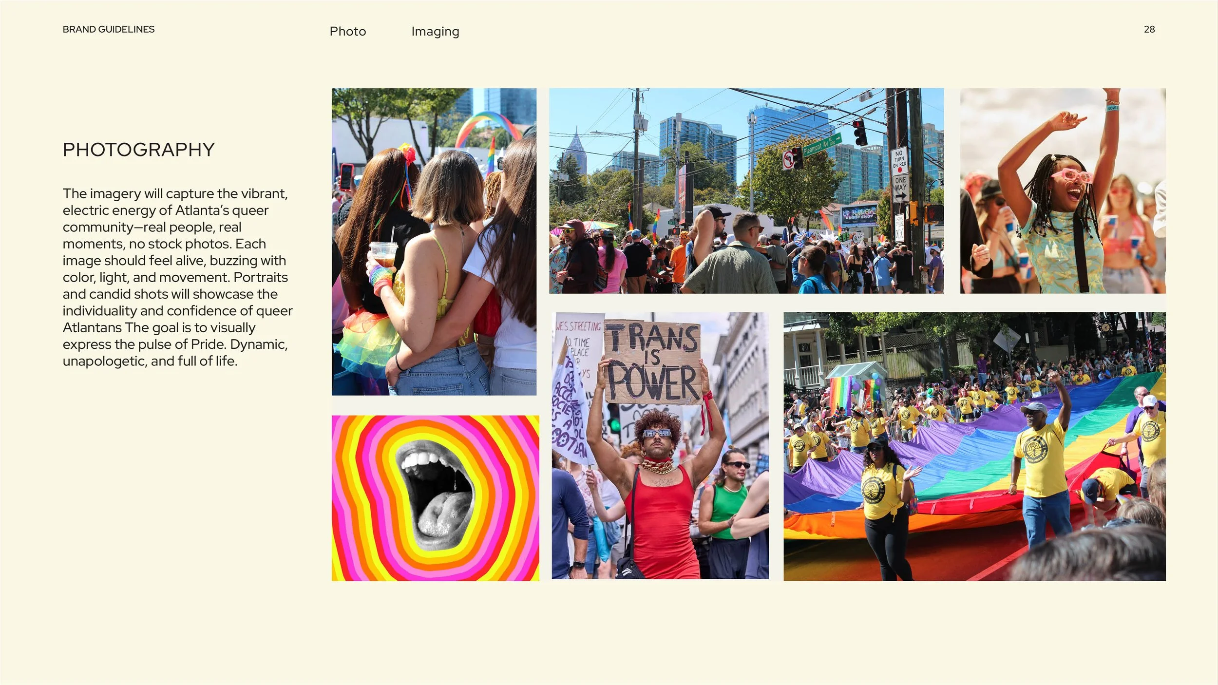
Atlanta Pride had a problem: its branding didn't reflect the energy and culture of the community it serves. As the largest free pride festival in the Southeast, it needed a look and feel as welcoming and vibrant as the celebration itself.
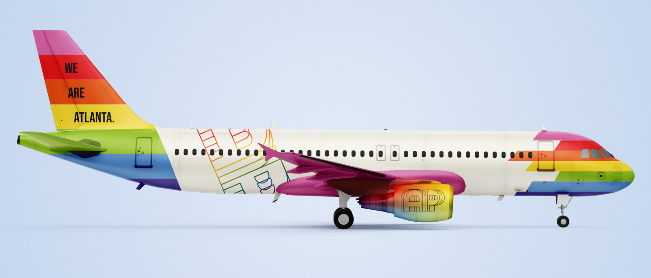
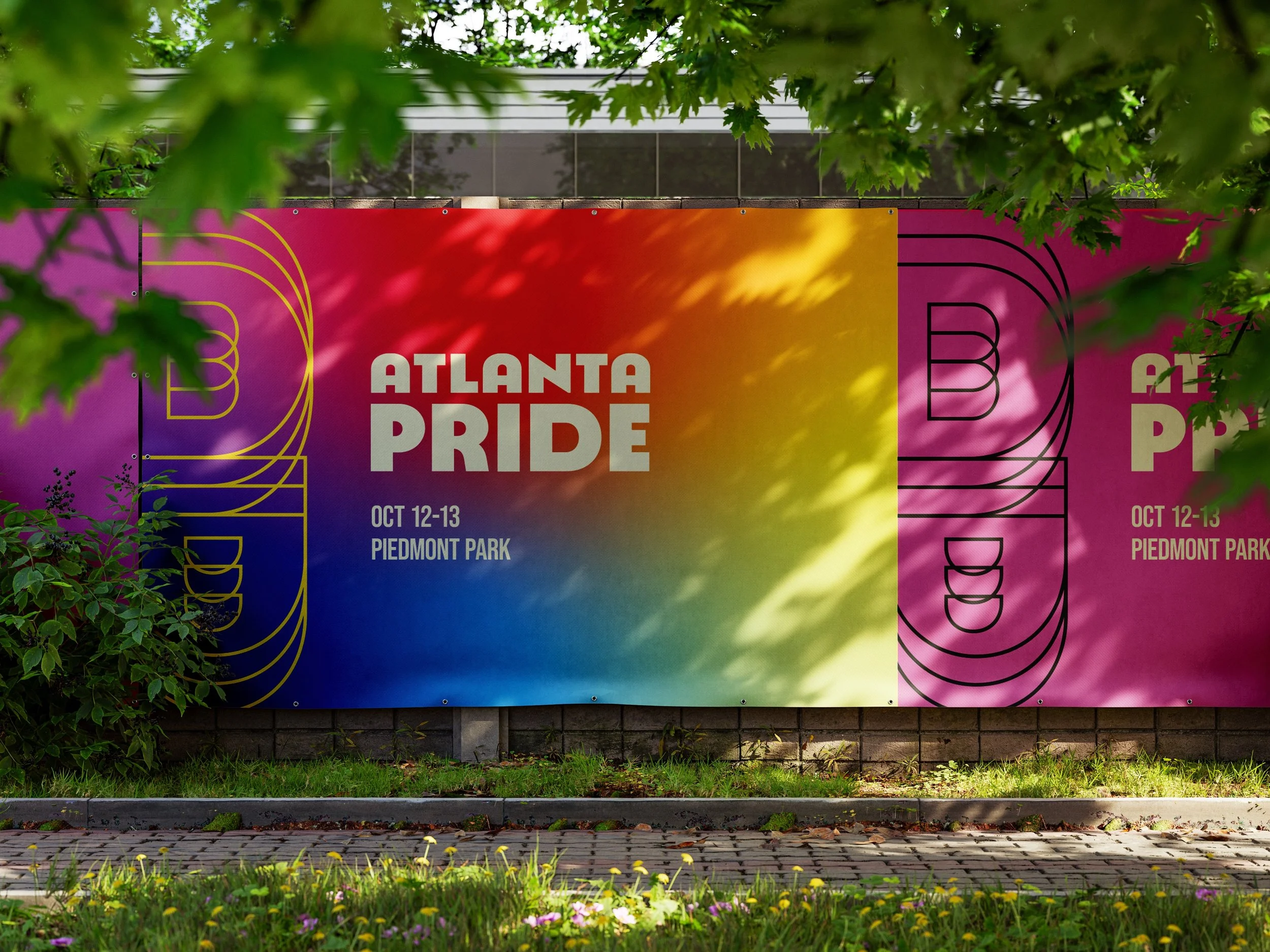
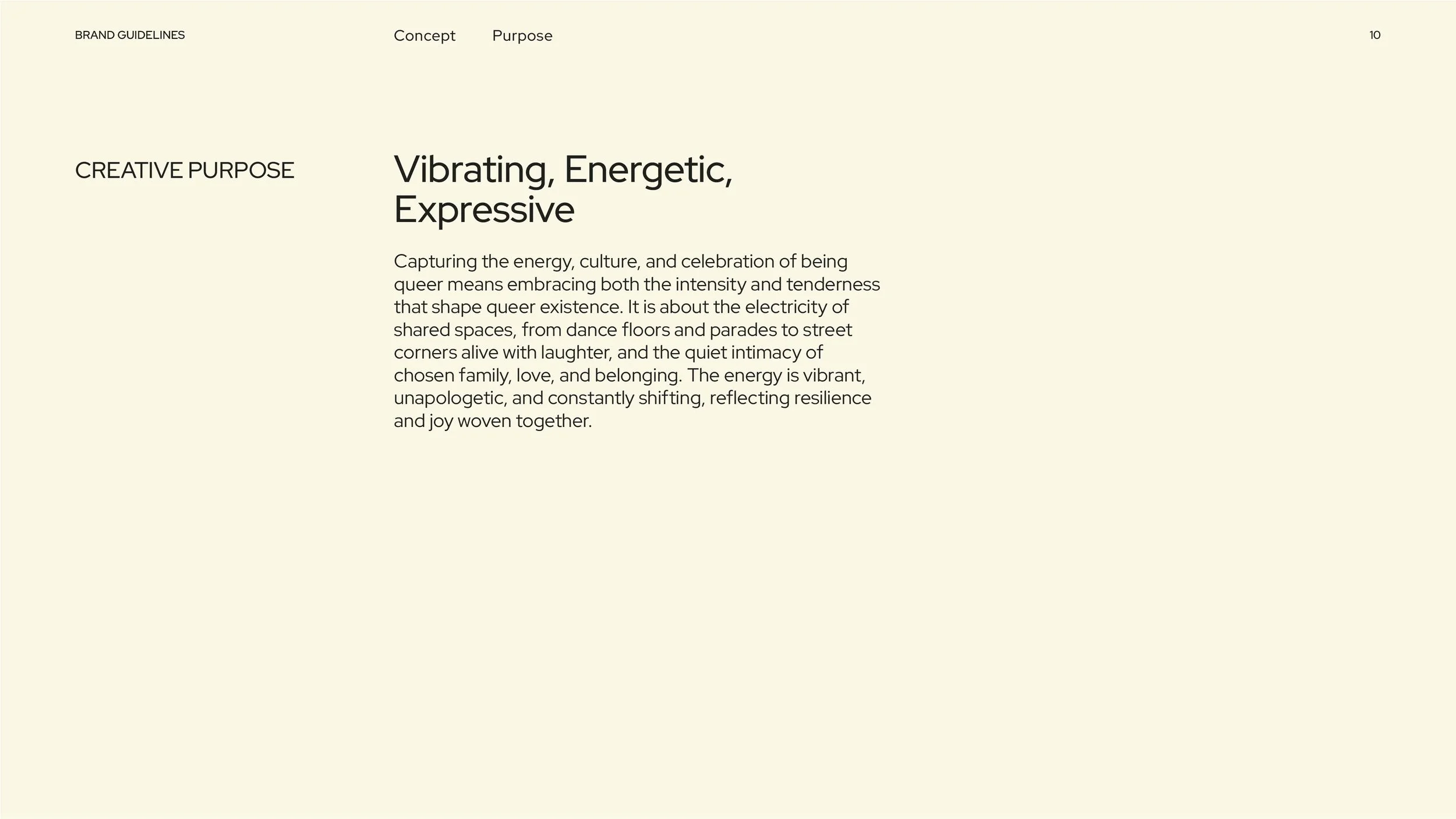
My concept captures the electric energy of queer celebration: vibrant dance floors, parades, and streets alive with community. Unapologetic, dynamic, and rooted in resilience and joy. I created the complete brand identity and graphic system, including logo, brand guidelines, wayfinding, and event collateral.
Role: Brand Identity, Art Direction, User Research
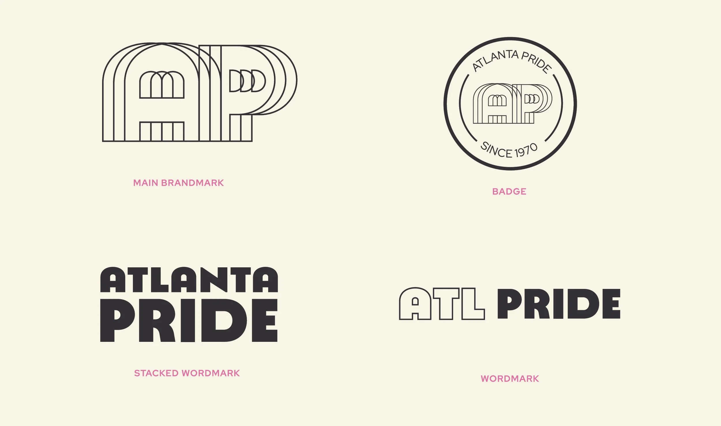
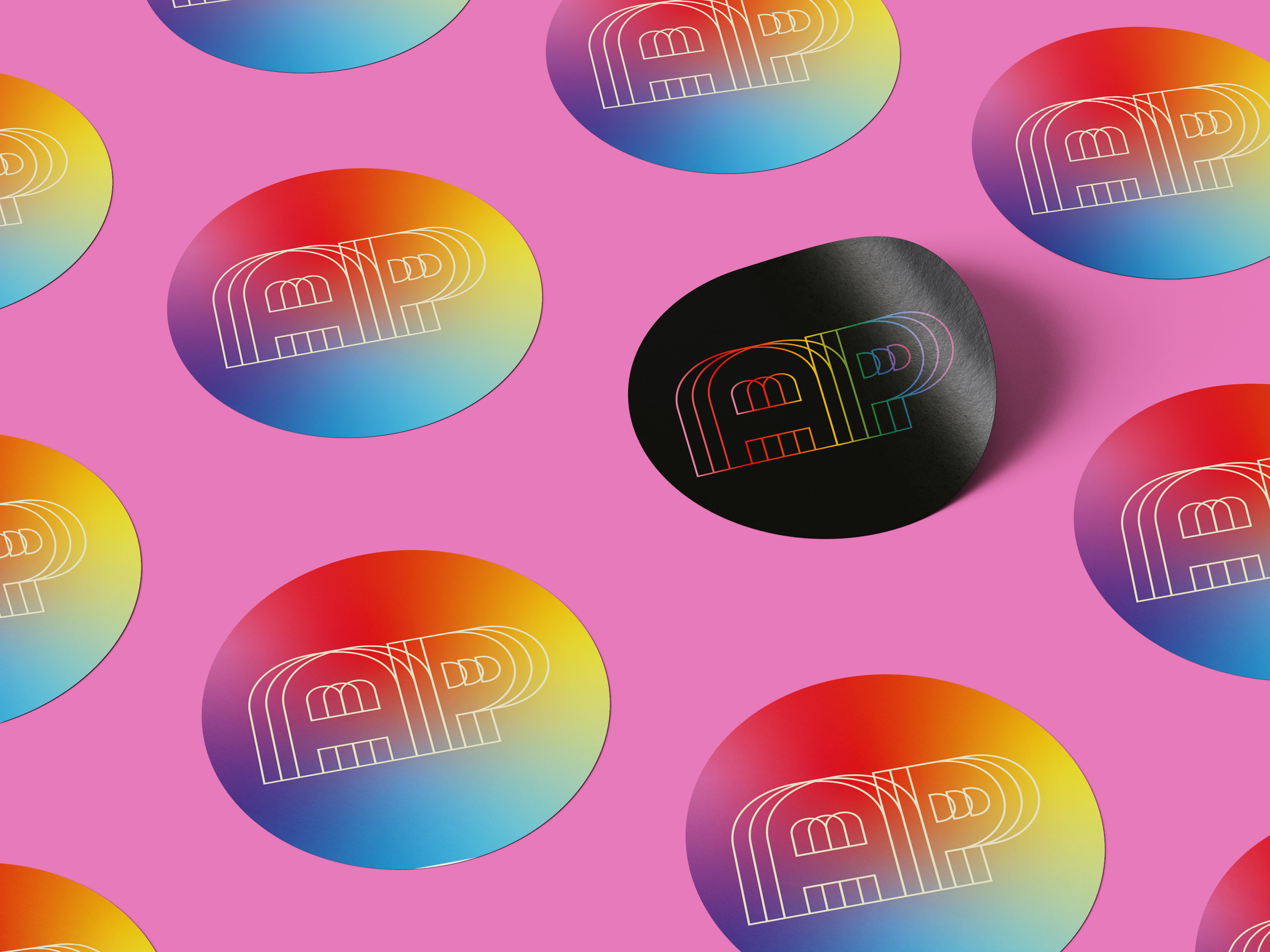
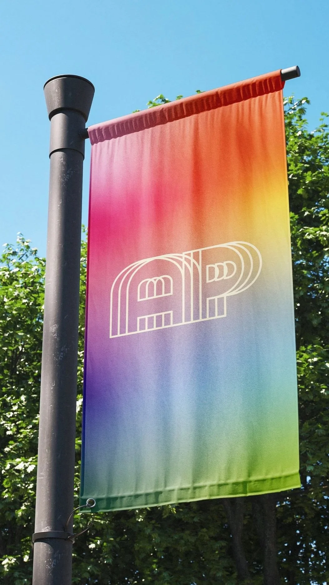
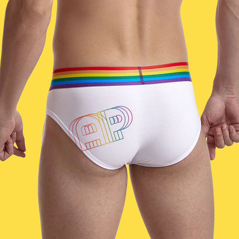
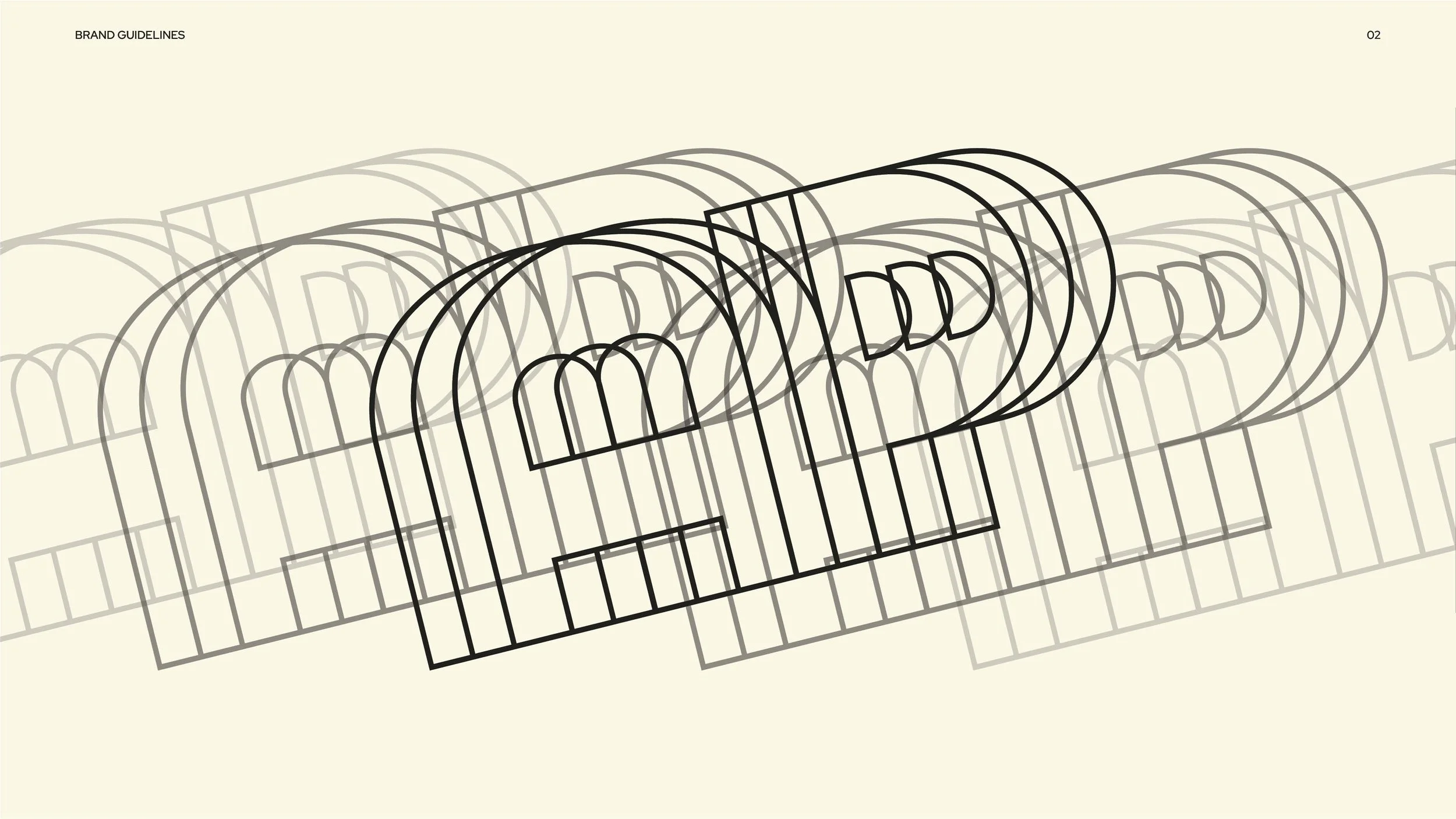
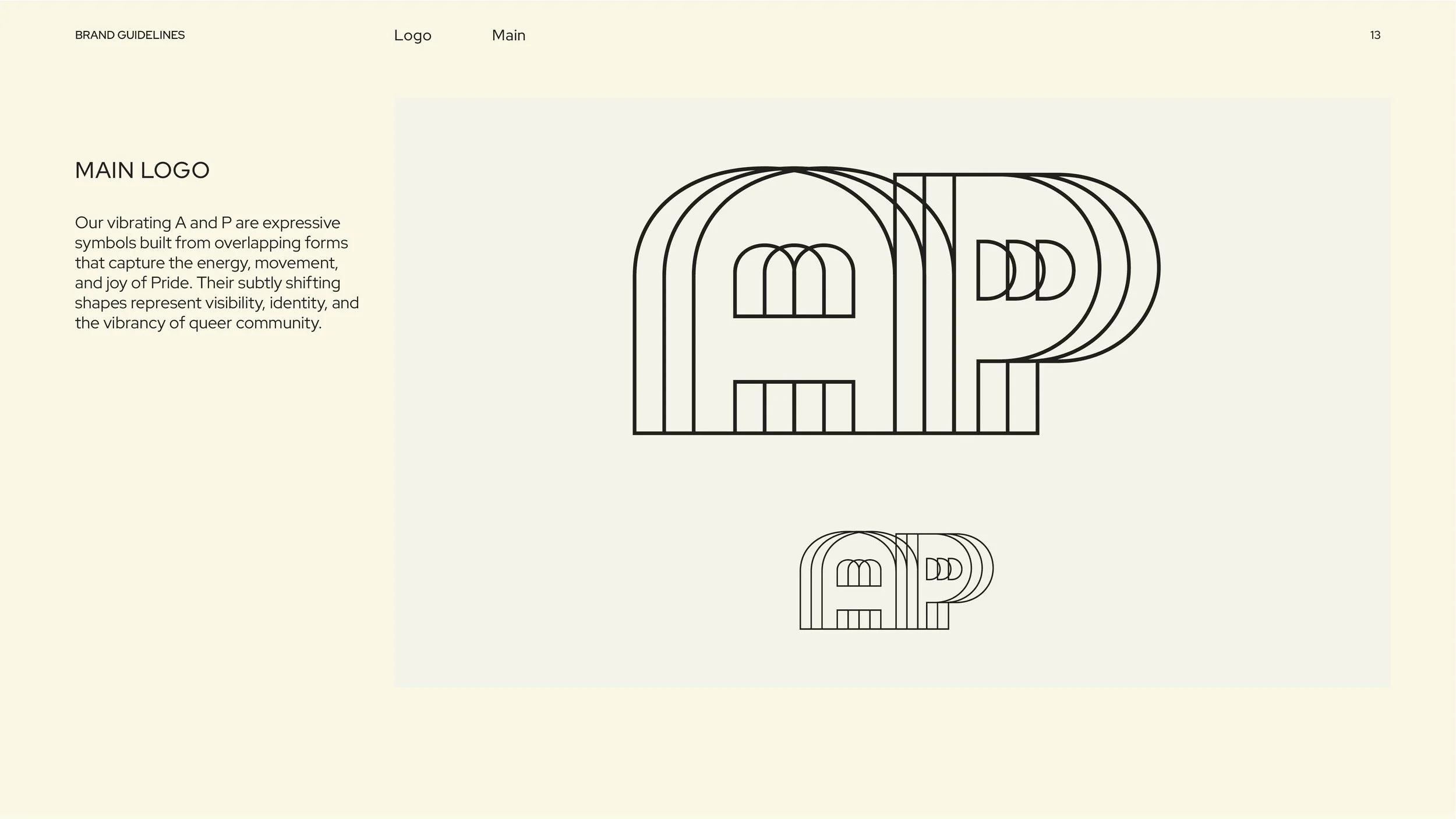
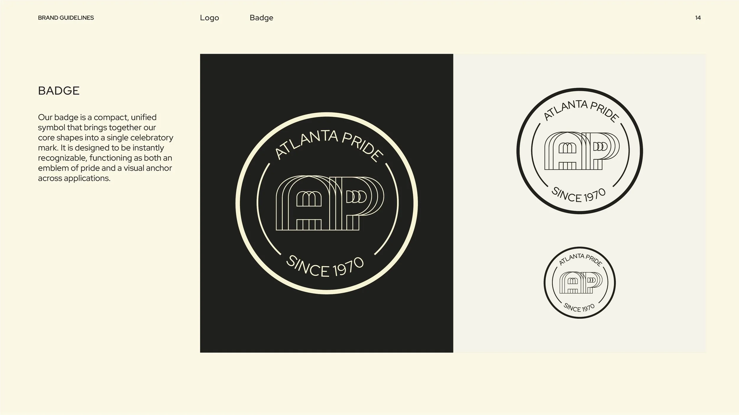
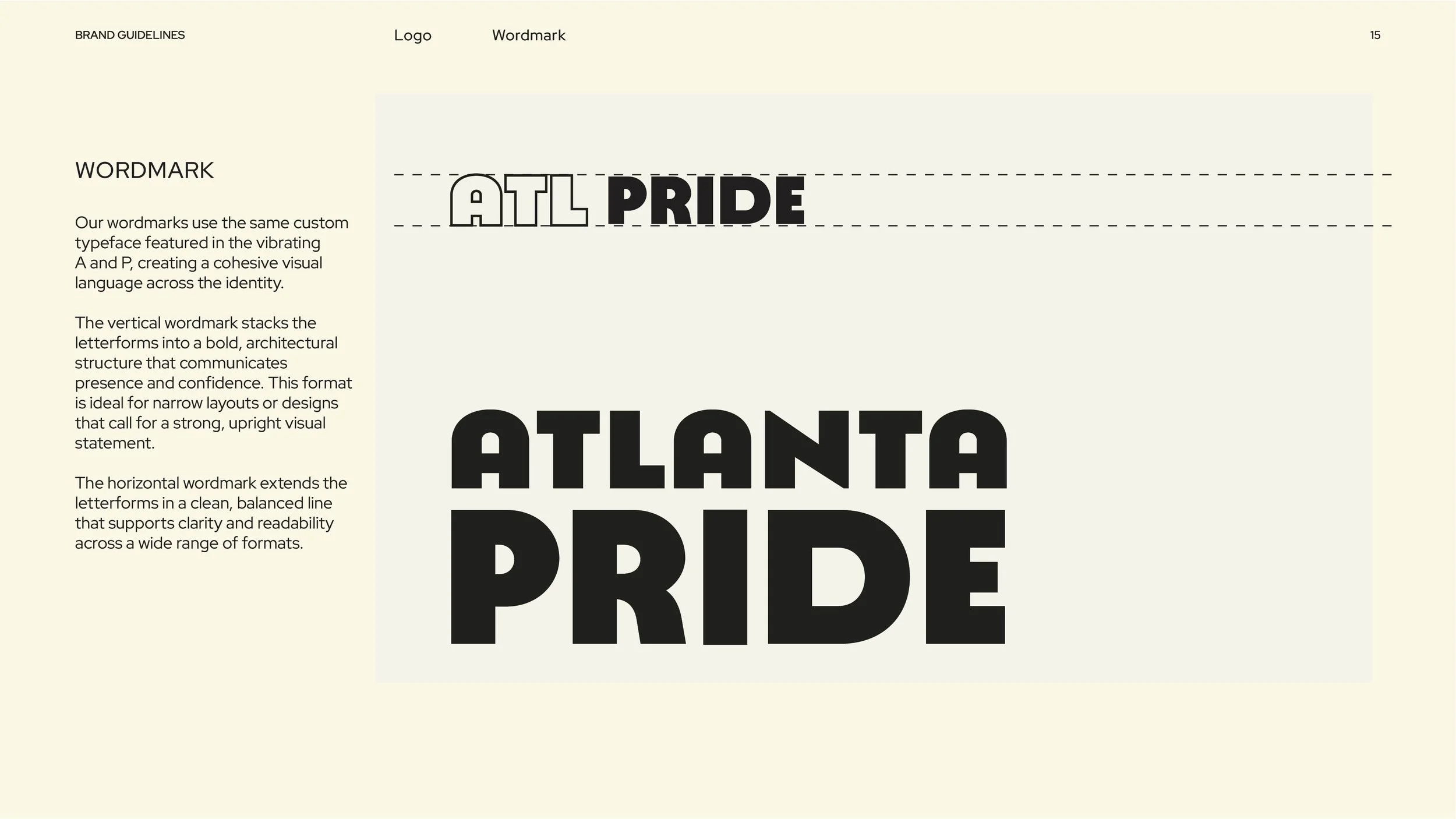
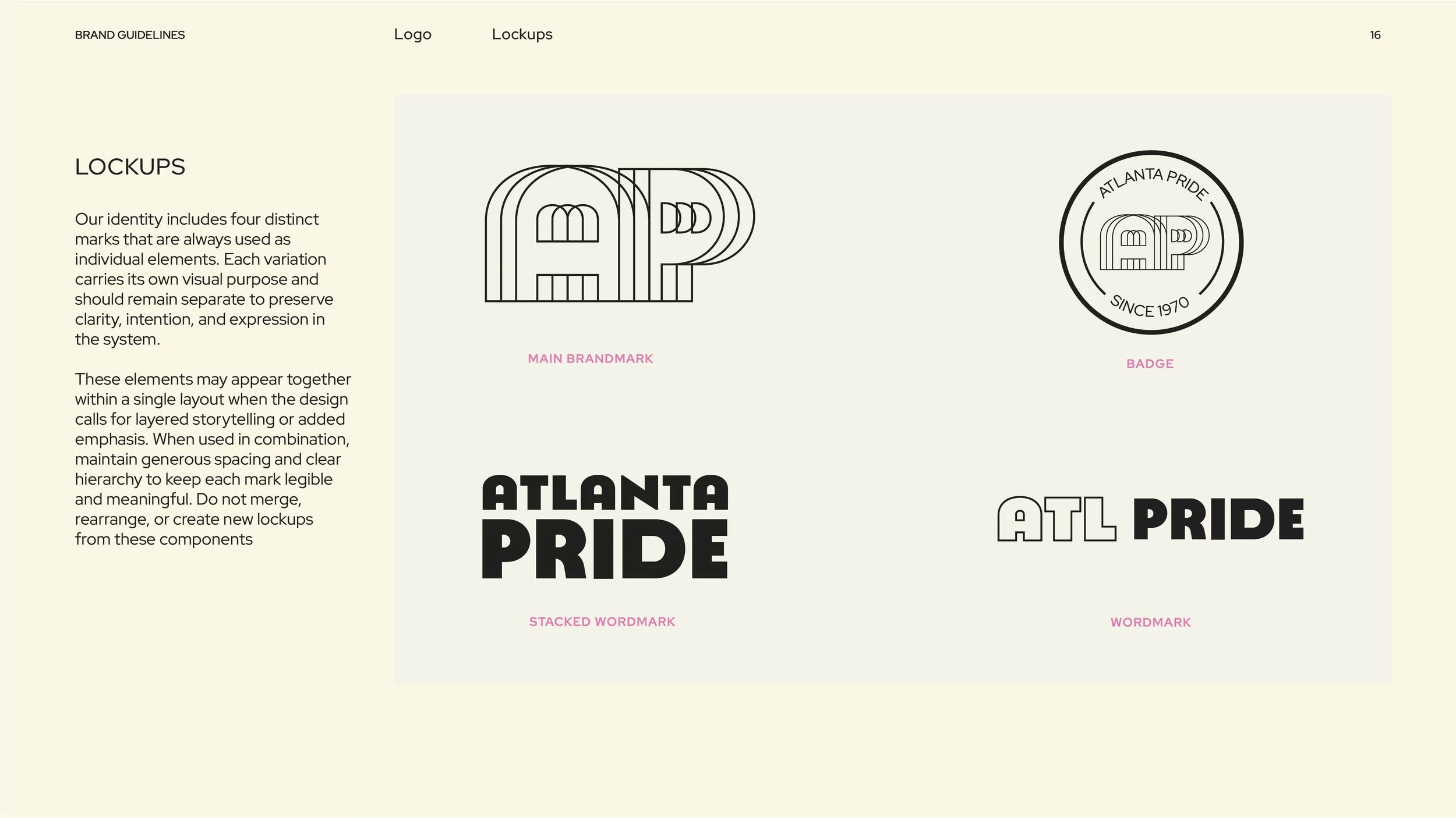
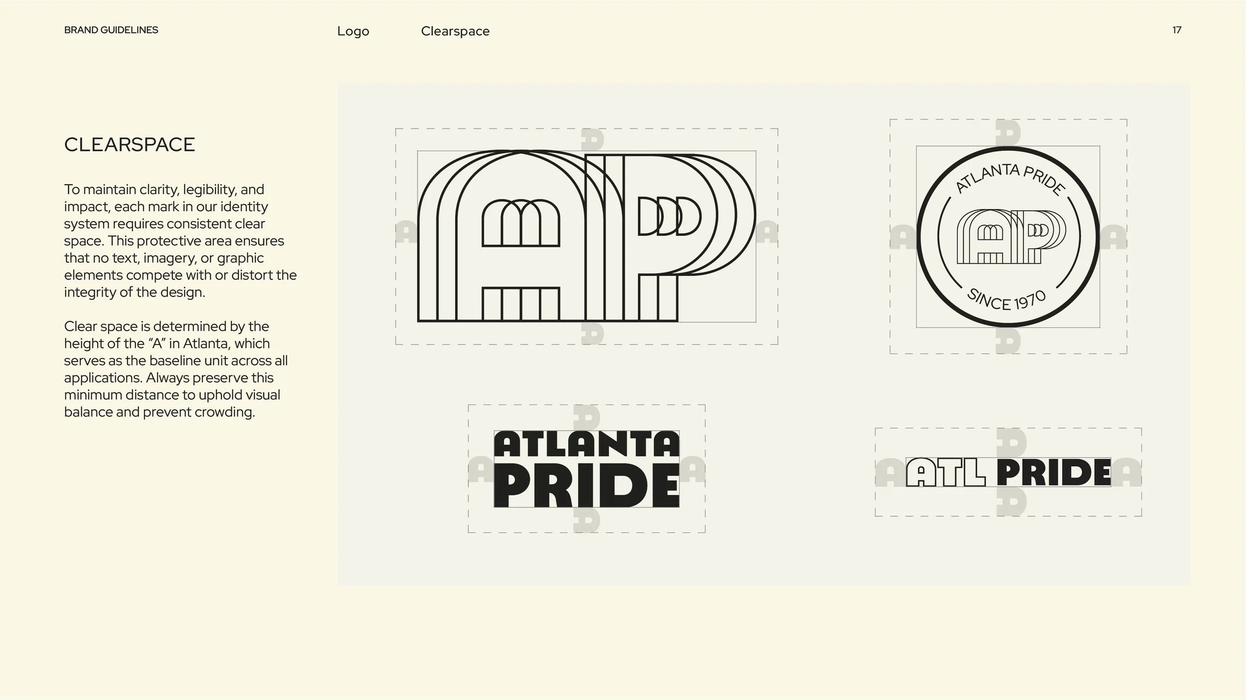
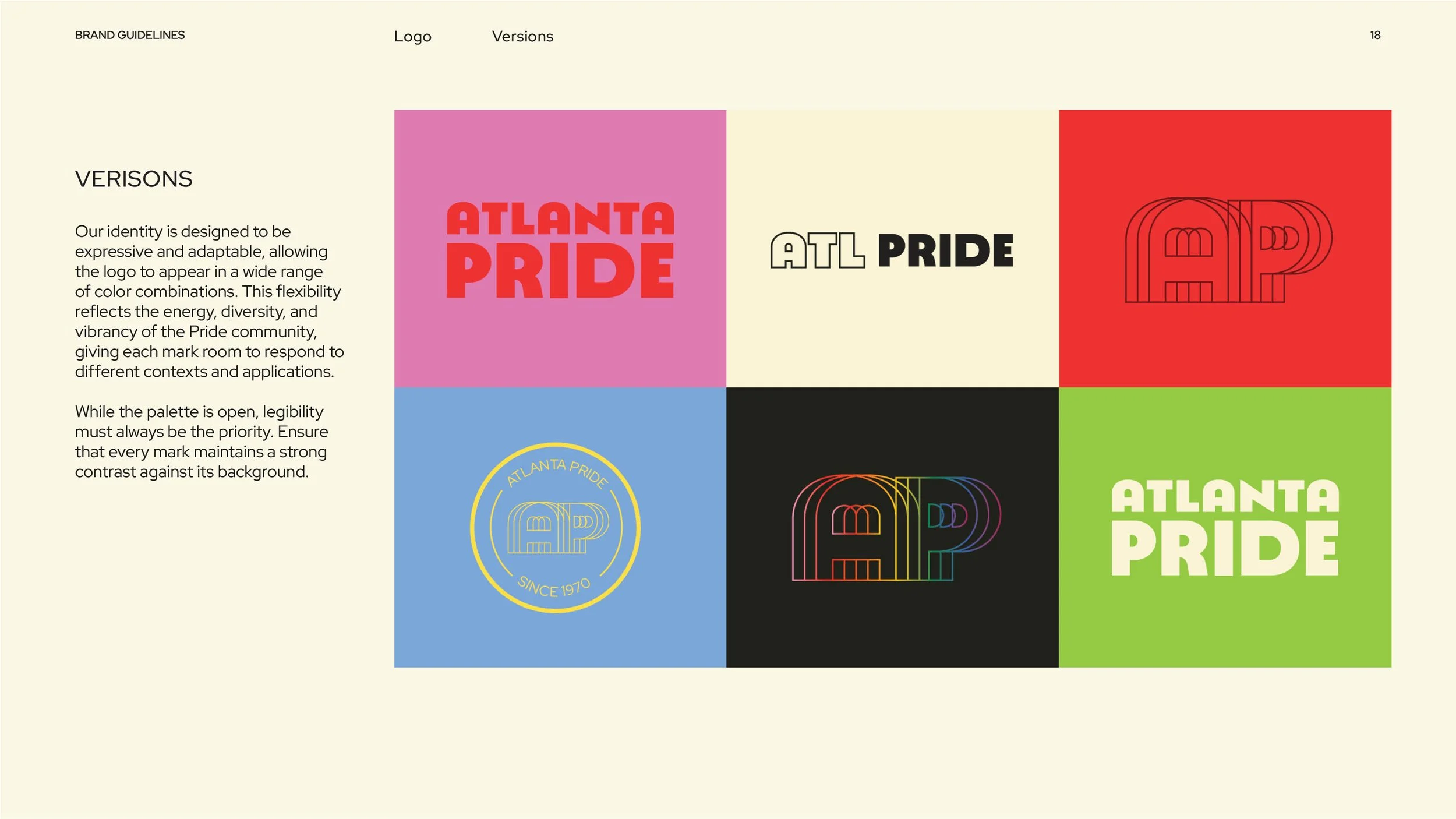
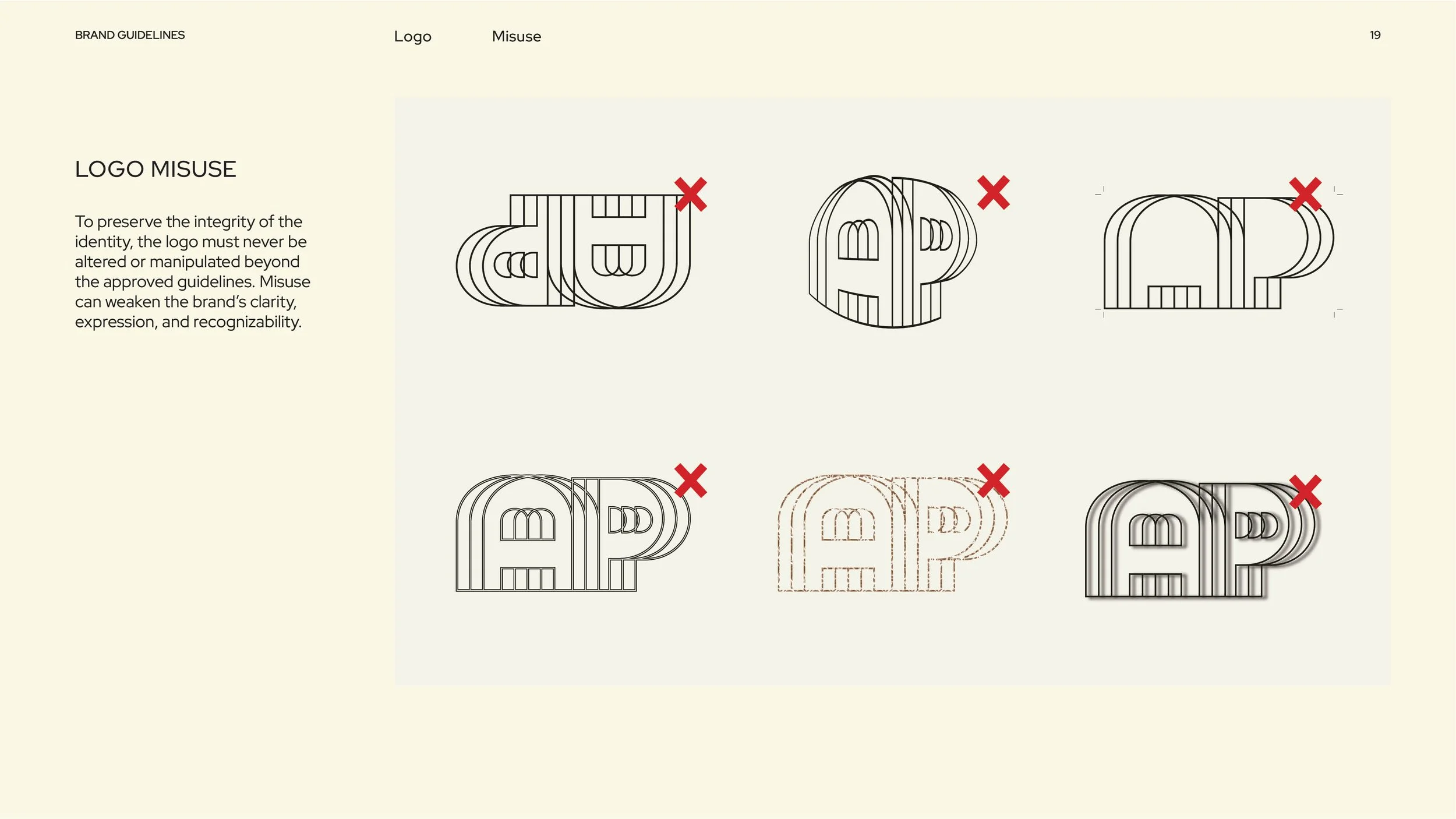
Logo System Design.
The identity uses four distinct marks that work independently. The vibrating A and P captures pride's energy and movement. Three supporting marks (a historical badge and two word marks) provide flexibility across applications.


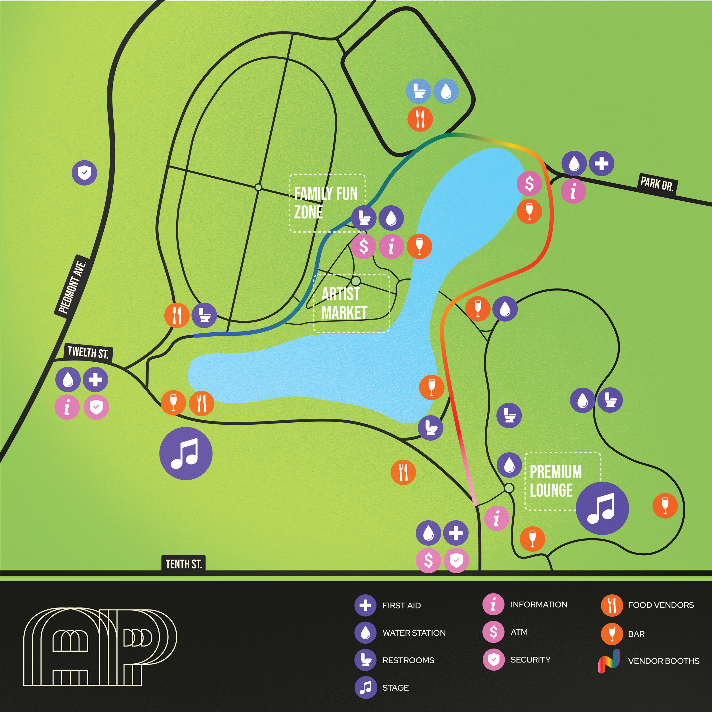
Map Design.
Atlanta Pride lacked clear wayfinding at Piedmont Park. This map simplifies the park's layout and highlights everything visitors need: stages, vendors, resources, and key locations.